
This year I took the course "Illustrated book cover" by the most incredible, and unique Paula Cruz with Plato Studio. It was packed with information, and passion, and as part of it, we were invited to work on our own mock-project.
I chose "The hour of the Star" by Clarice Lispector, because I am a huge fan of her work, but also because there aren't that many illustrated covers for her books.
This is my final cover, and below I share a little of the concepts behind this project.
The book starts through the view of the narrator "Rodrigo S. M", describing how he must tell a story, and his obligation to do so as a writer, as if it is something he has no choice on. Almost half way through the book he tells about the life of "Macabéa", an immigrant from the northeast from Brazil, moving to the big city, Rio de Janeiro, and how she trying to survive.
A lot of themes, about our existence,anonymity, being crushed by poverty, are covered in this incredible (only!) 100 pages long book. Macabéa is described as nearly invisible, washed out.Throughout the book we understand she doesn't have much of a say on her own life, as her conditions are already established by society.
And while trying to approach some of those themes, below there are some of the thumbnails I worked on:
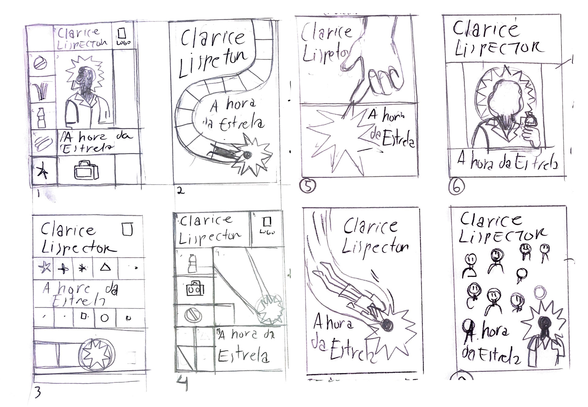
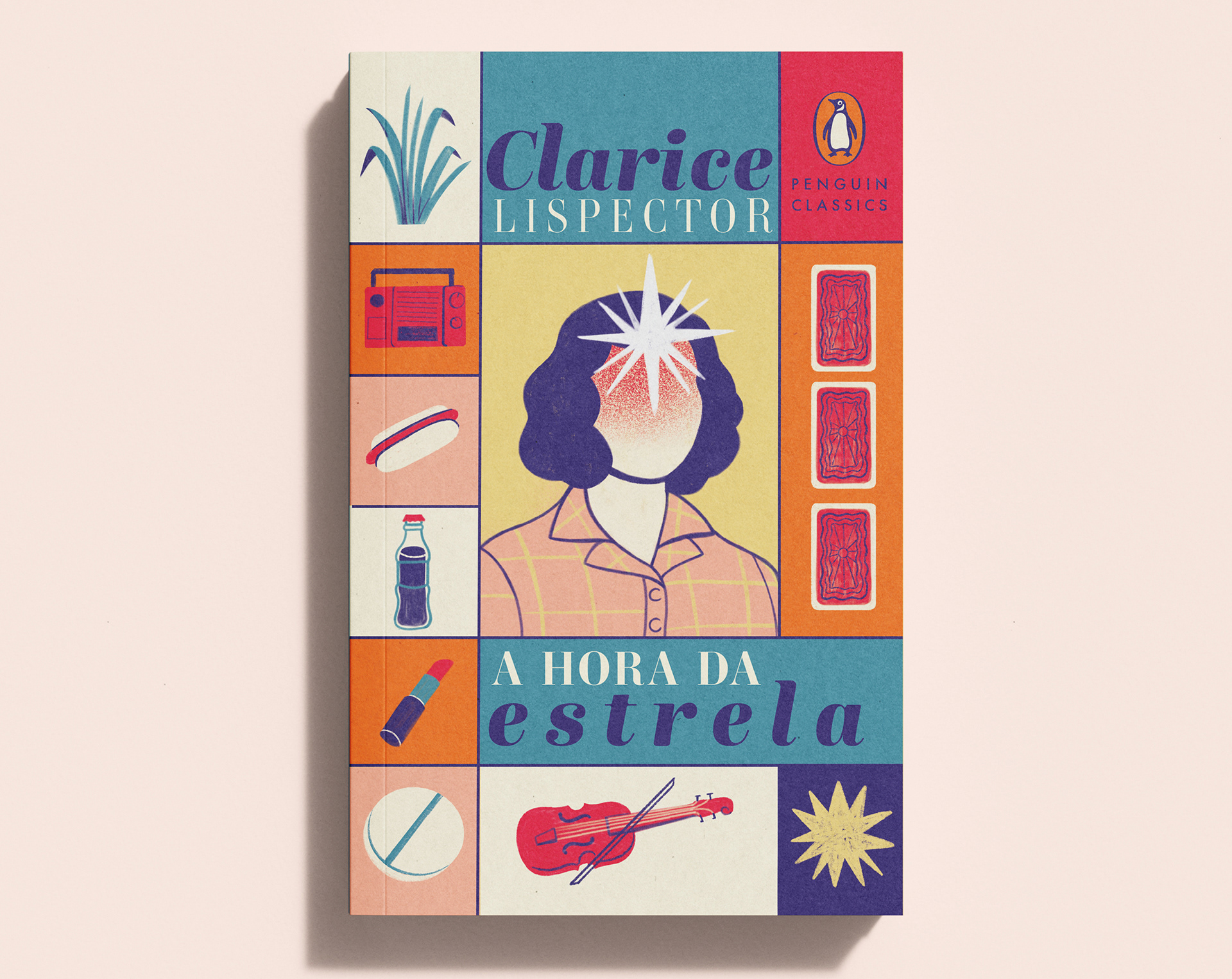
I came across the idea of trying to create segments, as if in a board game, where there Is only one final "house" to reach to. This idea also plays with the concept of someone being in control of her "destiny" - such as the narrator, that has to tell her story. Clarice, gave 13 titles to this book, so I tried to keep this number on the segments on the cover to play with that. Some of the other ideas played around with invisibility, having to follow a predefined path ,and of course, the image of the star which is very symbolic to the story (but I won't say more to not spoil it).
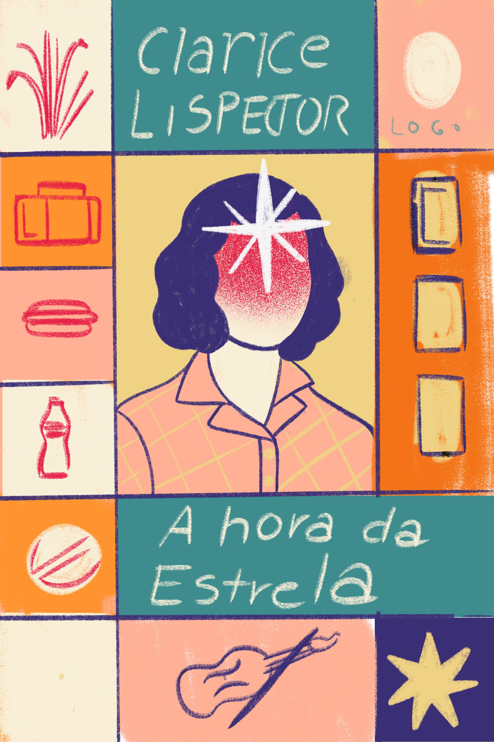
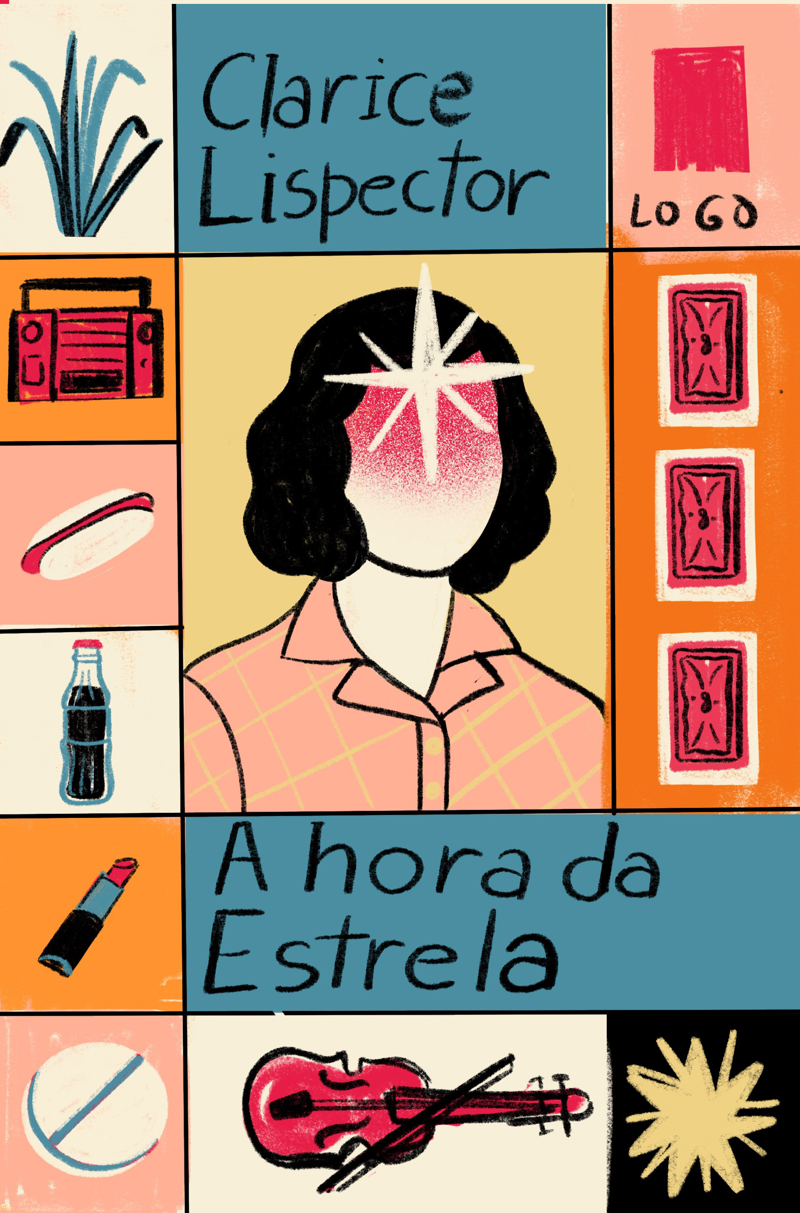
I chose to go with this first concept, creating the segments, but in a more "pop" composition. Her being the main image, but with an invisible face. The other elements represent the few things described in the book that can be linked to her own personality.

The color palette was loosely inspired by board games from the 70's, but instead of black for the lineart, I used blue to make even more evidently "washed out".
I chose to work on big blocks of color with lightly faded textures.
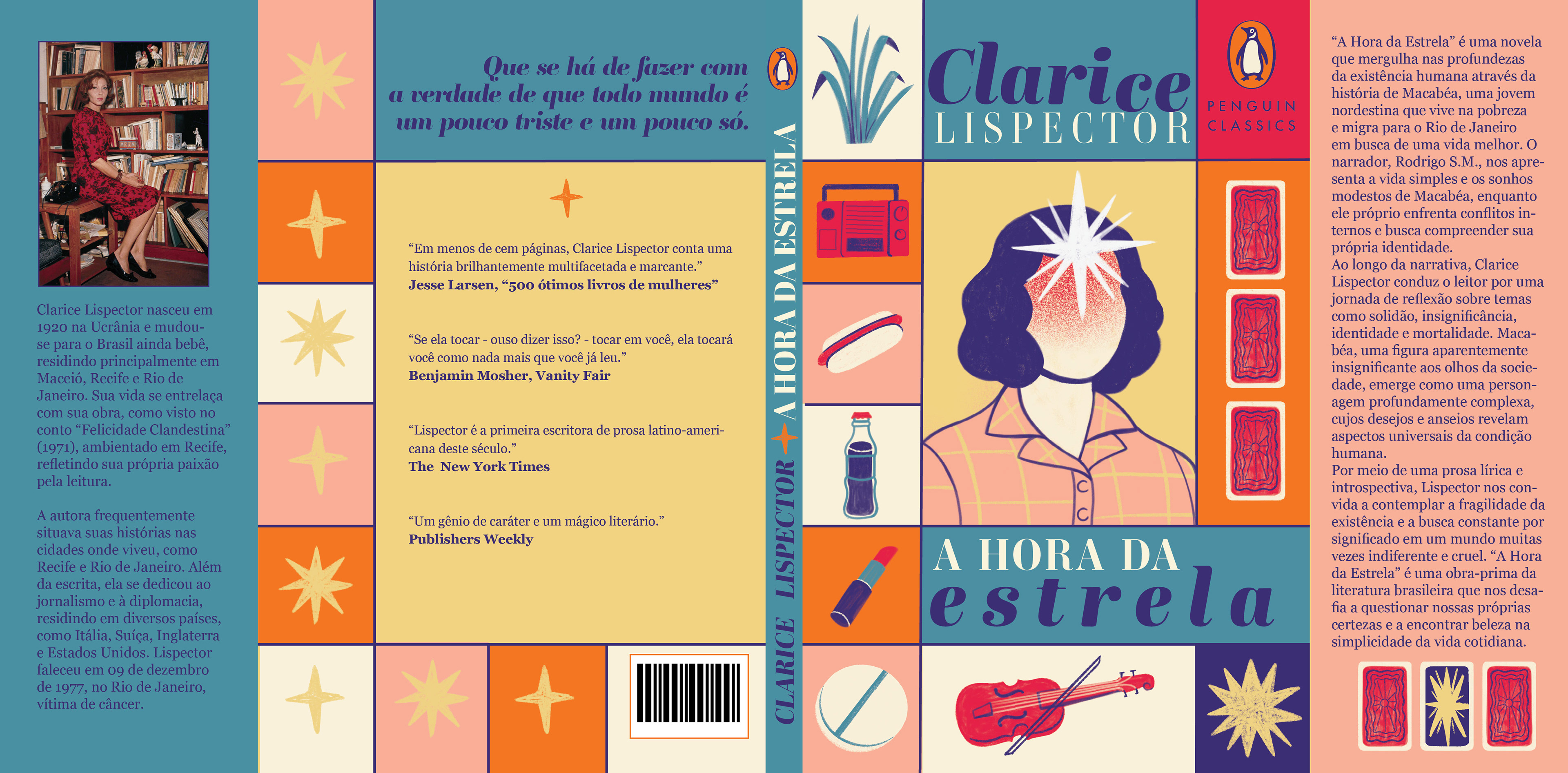
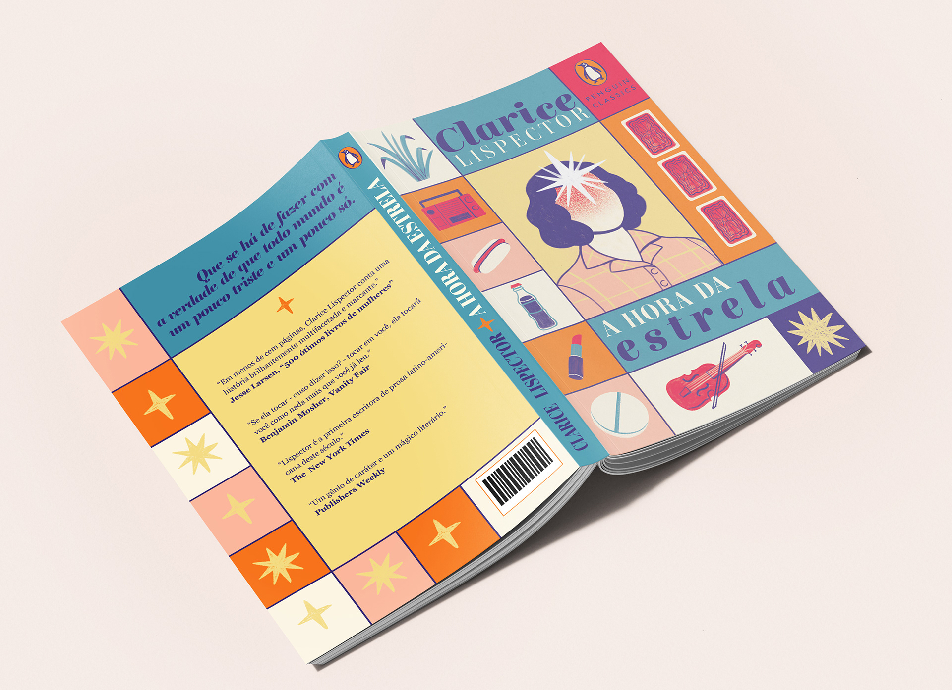
As part of the course, I designed the cover as a whole with title/author, as well with mock elements/text to suggest how it would look like. It was an incredible process to think about all the pieces, narrow down concepts, and of course, draw it all!